

 Yes, it's back!
In the 1980's, at the same time that Watchmen and Batman: The Dark Knight Returns were redefining mainstream comics, there was also an explosion in black-and-white comics put out by smaller independent publishers. These comics ranged from the mainstream-parody Teenage Mutant Ninja Turtles to rank imitations like Adolescent Radioactive Black Belt Hamsters to serious (though experimental) titles like Maus and A Life Force, as well as a ton of non-superhero action titles like The Realm and Trollords and Eagle.
And in 1986, Fantagraphics Books published a 10 issue miniseries titled Threat. It was an anthology series, and you can tell by the title that it was meant to be full of the edgy edginess of which Fantagraphics believed itself to be the leading edge. The four titles running concurrently in each issue (and alternating covers) were:
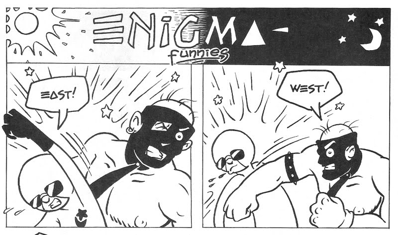
"Enigma," about a cute little cartoon assassin who roams the wastelands like Lil' Mad Max, killing muties with a big wrench. Was it edgy? Let's see. Hip ironic detachment? Check. Graphic violence rendered in a humorous, funny-animal style? Check. Trendy, new-wave graphics in the logo? Oh yeah, check.
"Zone," a drama about a mysterious creature roaming the polluted wastes of New Jersey. Was it edgy? Let's see. An aspiring writer and a goth-punk art school girl who always dresses in black as main characters? Check. Clunky environmentalist message in the main storyline alternating with abstract tone-poem interludes? Check. Trendy, new-wave graphics in the logo? Oh yeah, check.


"Bob Mercenary," a futuristic comedy-action story about a mercenary named Bob (that's him on the front cover of issue 1 above). Was it edgy? Let's see. Stylized, cartoony hero juxtaposed in a more realistic world? Check. Trendy, new-wave graphics in the logo? Oh yeah, check.

"The Holo Bros," a science-fiction comedy about a group of spacefaring thieves who get caught up in royal intrigue. Was it edgy? Let's see. Funny animal aliens who just happen to look sort of like the Three Stooges engaging in lethal violence? Check. Trendy, new-wave graphics in the logo? Oh yeah, check.

Which is not to say that Threat was bad, only that in execution, it was never as good or as cool as it obviously thought it was. Jim Rohn, writer/artist of "The Holo Bros," went to draw Battle to the Death for Imperial Comics. And Jay Geldhof, artist on "Bob Mercenary," went to acclaim as the inker for the Pander Brothers on Matt Wagner's first big story arc on the Grendel series.
But looking at it from almost 25 years on, it's obviously a product of its times and not a second more, cemented in the graphic trends of the early-to-mid-80's. Every issue had a special piece of artwork on the inside front cover, accompanying the Table of Contents, and just about every one looks like this one--attractive, but dated.

The Wave, It Is New!
The thing about the edge, you see, is that it's really thin, and though it may be sharp, it doesn't stay sharp for long. By the time Threat reached its last issue (number 10), it's edge had grown extremely dull.


No comments:
Post a Comment